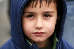
 The idea of making Children's areas truly easy for kids to use has been on my mind alot over the years. Periodically I like to walk into my place of work, sit down in the entrance or lean against the wall and just take a good hard look at the things that first greet me as I walk in. I imagine myself as a child just coming into the Children's area for the very first time.
Then I ask myself some questions:
* Are the materials reachable by people under 5' tall?
* Is it clear where the different categories of age-appropriate material are kept?
* Do signs use language understandable by 7 and 8 year olds?
* Are the books tattered, old, crowded, falling down on the shelves?
* Does the staff smile and greet kids when they come into the room?
* Is the entrance so crowded that there is no space of welcome for the kids?
The answers to these questions give me goals and objectives to work on making the room more kids-friendly. It points me to leaving the top shelves empty on stacks created for adults in mind to make sure books can be reached by kids. It helps me streamline and simplify signage - and even use objects with no wording needed (a football for sports books; a dinosaur; a firefighter's hat) to help pre-readers and early readers locate books in favorite dewey subjects.
It helps me help staff freshen up collections by weeding and sparkle them up by straightening them on their shelves and pulling their spines out to the shelf edge and out of the dark cavern at the back of the shelves. It reminds me to keep the fun in my attitude on desk and encourage staffers to maintain friendly behavior with the public. And it helps us all focus on ways to open up the space in our Children's area - even if we are in a crowded space ansd may never see a new building or remodel to give us more space.
By keeping that kids eye view, we can continually improve our space and service. So hunker down and see what you can see!

No comments:
Post a Comment